UX design is an approach or technique to analyze every aspect a client’s specific business objectives which has become essential to a successful website.
Long-established methodologies in web design was that websites should minimize the need for scrolling, and to keep the most important information up front. However, there’s new school of thought in our current digital world. Web users today have become acclimated to scrol down the page to obtain a complete understanding of the content. Now, even Google prefers websites that have longer sessions duration, and one of the more likely ways to accomplish this is to entice visitors to scroll by creating unique experiences.
Incorporating
parallax scrolling provides online visitors with exceptionally impressive
experiences, while accomplishing a variety of goals such as:
–Attracting site audience into unique experiences
–Engaging visitors to CTAs (Call To Actions)
–Providing natural movement to otherwise inanimate images
When executed correctly, the application of this technique captures and maintains audience interest, and makes outside distractions less likely to dissuade viewers from straying onto something else. By retaining viewer interest and attention, the website can help to accomplish multiple goals of site marketing.
Let’s
take a step back and actually review what parallax scrolling really is.
What Is Parallax Scrolling?
Parallax
scrolling is an advanced scrolling technique used in web design where background
images throughout a web page move slower than foreground images, creating an
illusion of depth on a two-dimensional site. It is one of the most desired
design techniques in web design today. It is a simple motion that you are
already accustomed to, and it’s helped make many websites feel dynamic and
interactive.
It’s
important to brainstorm how parallax could affect the mobile experience. To
increase site speed, and not infringe too much on mobile usability, it’s
typically advised to either reduce parallax scrolling.
Because
parallax scrolling can be utilized in a variety of ways, there’s no shortage of
inspirational examples. It’s easy for web designers to go overboard with
parallax scrolling to the point where it becomes overwhelming and often
confusing, thus counter-productive.
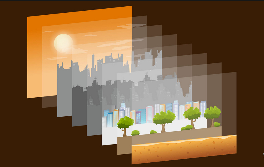
Parallax designed websites captivate online audiences with an engaging visual narrative that leads to the viewer scrolling continuously down the page. The effect is created by using two elements where the first element is a background that remains constant, but that scrolls more slowly than the foreground.
The designer accomplishes this effect by creating image layers, not unlike physical transparent overlays (reference exhibit below), that are independently manipulated to provide a 3D visual illusion.
As the foreground visuals (overlays) change and move, and the background (first layer) remains slow or constant, users experience a greater sense of depth. The effect is as close to three-dimensional viewing as a user can get on a two-dimensional screen.
What are the Benefits of Parallax Design?
As users view the site’s imagery, they are able to control scrolling
elements. This leads to greater user interaction and engagement, thus
maximizing the length of their session. The site’s minimal use of words and
text tends toward a highly professional and polished atmosphere.
Organizations that employ parallax design elements are frequently creative in nature, promoting visuals over services. Examples of the types of organizations that especially benefit from parallax effects and parallax scrolling designs are arts organizations, advertising and marketing firms, real estate sites, restaurants, hair salons, tattoo parlors and tech/gaming companies.
When is Parallax Design Problematic?
Mobile users might experience difficulty viewing and interacting with
long-scrolling parallax sites. Though this problem is easing as gains are made
in responsive technology, this can still be problematic on older browsers.
Other problems involving the incorporation of parallax design elements into
a site are similar to problems that typically plague user experience designers.
Regardless of scrolling techniques, designers must have a deep understanding of
the organization’s intended audience.
Nice visuals and pixel-perfect UI aren’t enough to stand out in a sea of apps. Without animations, even the most thoughtful interfaces can confuse users and make them feel like they’re making choices without context. Good website design includes animations to elevate the user experience of your design to the next level, delivering your users a delightful, satisfying, and smooth experience.
In
this article, my goal is to collect all the key principles that are
indispensable when creating animated interfaces regardless of which tool,
framework or techniques you’re using.
It’s all about focus and attention
The most important purpose of any animation is to provide context and direct the focus of the user for a guided and fluid experience. Animation helps to connect otherwise unconnected screens, so the user never feels lost when navigating and using your app or website. To get the best results from your animations, restraint is key. It’s tempting to get carried away with animations and animate everything on a screen, but this defeats the core value of incorporating motion in the first place.
Use sequences to bring order and hierarchy into your animations. Animating every element at once on a user interface feels like when everybody is talking in a room at the same time.
When
you need to animate multiple elements on a screen, always use a short delay
between them. Be sure to keep the same easing and duration of the animations,
so everything feels consistent. For quick and fluid animations, try to use no
more than 20ms delay between animated elements.
Speed is the key to good animations. The speed of the animation is usually controlled by changing the duration of the animation (how long a transition lasts) and by easing (acceleration over time). The duration of animations can make or break the overall user experience.
Well-timed animations are
everything.
As
a general rule, try to use animations with 0.3s-1s duration. Animations shorter
than 0.3s can feel almost nonexistent, since it’s easy to miss the
transition—and, when the user does notice them, that speed can cause
stress and confusion in the user. Long animations aren’t much better, though;
animations longer than 1s can feel slow and get in the way of interacting with
the interface.
A
huge benefit of using quicker and snappier animations is that it can make your
app feel faster; unfortunately, the opposite is true as well. If your
animations are lagging, your app will feel broken, generally slow, and
unpleasant to use.
Speed
isn’t only applicable to the duration of the animation, but also to the lag
between the trigger gesture and the beginning of the animation. For example,
when swiping between images, if there’s a lag between the swipe gesture and the
beginning of the animation, the complete experience is ruined and quickly
swiping between images will feel like an impossible task to do.
Respect the laws of physics
In
the real world, nothing starts or stops instantaneously. Things take time to
speed up and slow down, thanks to natural forces like friction. The more
naturally an animation behaves, the less cognitive load is required from the
user to get used to it and understand its purpose.
Beyond an animation’s duration, though, be sure to get familiar with different types of easing (acceleration over time). Easing types used in design:
Linear: Animation without any kind of easing is the most unnatural type of easing, so use it wisely and only when necessary.
Ease-in: Accelerated easing is animation starting slowly and ending fast.
Ease-out: Decelerated easing where animation starts quickly and decelerates at the end. Ease-out is generally the best choice because the fast start gives the feeling of responsiveness while still providing a natural slowdown at the end.
Ease-in-out: Accelerated and decelerated, similarly to how a car moves. Be sure to use it with shorter animations (around 0.3-0.5s); otherwise, it can feel slow.
Spring: Animation with a bouncing end. Often used in modern apps because of its playfulness and responsiveness.
With
the right animations, your app can feel like an extension of the natural world
instead of an abstract, strange, or disconnected experience.
Connect animations to interactions
Animations
are usually triggered in two scenarios within apps: During/after loading a
screen, and when users interact with the interface through swiping, tapping, or
dragging.
The
type of interaction always determines the type of animation that will be
triggered. For example, if the user swipes up on the screen, the animation will
reveal the new element with a slide up animation from the bottom of the screen.
Another example is when a new screen slides in from the right, the user will
expect that navigating back to the previous screen will be possible with a
swipe left gesture.
When
designing and applying animations, always think about the different interactions
that will trigger those animations first.
Use animated prototypes to communicate your ideas:
Implementing animations, especiallycustom animations, is always a challenge and requires additional effort from both the designers and developers. To make this process as effortless as possible, many designers use high-fidelity prototypes that can be shared with developers, who can inspect and copy the code of the animations.
Using
high-fidelity animated prototypes is the most efficient way for designers to
communicate their animation ideas, solutions, and requirements with developers.
Be
sure to use animations in a consistent way, just like any other visual element.
Integrating your animations into your design system can be a game-changer for
your overall user experience and design process.
Summary
As
you can see, animations are a key piece of creating a great user experience and
not just an afterthought. Start thinking about animations and interactions
right from the beginning so you can focus on the overall user experience
throughout the entire product design process. These principles of animations
are timeless, and whether you’re just getting familiar with animations or you
already know everything about them, these are some key rules that always worth
keeping in mind when designing new animations and interactions.
I
can only encourage everyone to start experimenting with animations either for
iOS/Android apps or web-based projects. Animations are the most playful part of
product design! Hopefully, with these techniques, you’ll be able to elevate the
user experience of your design to the next level.
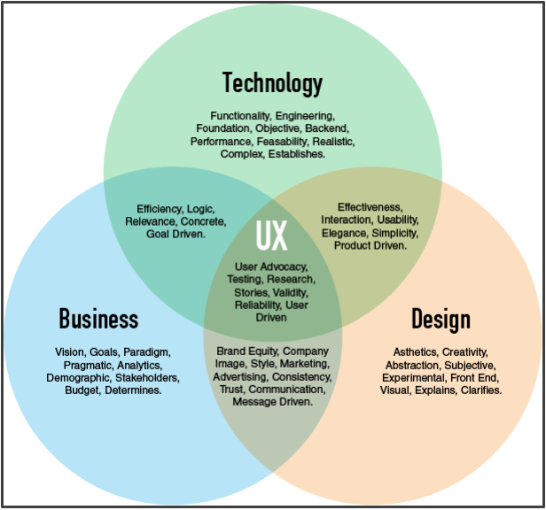
Let’s kick it off with a Venn diagram. It explains the role of UX and how it’s not a field in itself. Not only does it highlight the multidisciplinary nature of UX, but it also shows that most of the time the UXer forms the medium between other fields, often with conflicting purposes. Handling this tension requires very strong communication skills. Other communication-heavy tasks like presenting results, workshops, conducting interviews, or even selling yourself (for all you freelancers and “between jobs” people out there) benefit from improved communication skills.
Analytical Skills
This
is an essential one when dealing with data. Empathy and intuition help little
when facing the raw numbers of Google Analytics. Data has an increasing say
when it comes to product development and marketing, making the ability to set
up proper KPIs and to extract information from data invaluable.
Visual Design Skills
Working
in the UX field doesn’t necessarily require excellent visual design skills;
however, it certainly does give an advantage, especially if you have experience
in designing user interfaces. You need to understand typographical rules, color
theory, visual hierarchy, as well as being on top of the latest design trends
and best practices.
Empathy
This is arguably one of the most important ones. UX focuses on people. This profession ultimately aims to help them improve their lives, work, or whatever else your product is doing. Thus empathy is a core “skill” in user experience design. Developing the skill to think about problems from other people’s point of view is paramount. For some people this comes instinctively; others need to work more on this. One thing is for sure: You can’t do this job very well with an egoist mindset.
Understanding of Coding
For
most UX designers, their job deals with technology, so understanding what makes
up a digital product as well as the technological constraints and possibilities
provides an unbeatable advantage. However not only coding pros can use this
knowledge. Even a basic knowledge of HTML, CSS and Javascript can prove useful
in prototyping or interaction design. In dealing with interfaces, coding skills
can help design modularly.
It
also helps you design a product within the limitations of a development budget,
which is especially important if you are working at a startup, have a short
development deadline, or are heavily confined by a budget.
Project Management Skills
This
skill can come in handy in almost every job, but in UX it plays a special role.
The ability to precisely plan and execute a project is just the tip of the
iceberg. Incorporating the UX workflow with the development process can pose a
difficult task. Most teams work with an “agile” methodology, so learning how
that works will make you more valuable to employers.
Business Understanding and Strategic Mindset
UX
has gained a lot of influence in business and strategy lately. More companies
have started to recognize the relationship between user experience design and
business growth, which of course is shaping the role of UX designer
requirements as well. Every successful company out there should value a
designer who can think holistically and also understand business needs.
Designing
the worlds best login screen might be really interesting from a design
perspective, but if it doesn’t add a corresponding value to the business then
you aren’t adding as much value as you could be.
Writing Skills
Copy almost always forms part of the UI. Badly written copy on a button, error message or security note can destroy the entire experience. Writing is playing an ever growing role in UX, and many companies are hiring people purely for UX writing, which shows its importance.
To
improve my own writing I recently started writing articles right here on
Medium. If you haven’t seen my piece about why Chrome is now the best browser
for iOS, check it out here:
Critical Thinking
This
might seem like an odd one, but being able to differentiate between what looks
good at face-value and what is actually good can be the difference between a
decent product and an amazing product.
This
will also help you better identify what type of place you will be working for
and generally help when doing research for various UX projects throughout your
career.
A Healthy Curiosity
Yet
another soft-skill … seems to be a pattern here. UX is an ever developing
field, and what “worked” yesterday might not work tomorrow. What works in the
US might not work in Asia, and probably won’t work in a region like
Southern-Africa. So having a deep sense of curiosity is crucial to staying on
top of your game and exploring new ways to solve problems.
A
lot of people think curiosity is something you either have, or don’t have. Like
most skills it is definitely something some people are naturally better at, but
curiosity can be trained & maintained. I’d recommend downloading new apps
and trying them out every week, and keep an eye out for award winning websites and
products.
Evidence of UX designs are all around us. Household appliances are the result of some sort of UX process. UX designers research every aspect of using an appliance in order to make the user experience a positive. Designing bridges and tunnels, for instance, requires research of the location surroundings, communicating with engineers, analyzing traffic volumes and patterns, and investigating the design performance of other bridges and tunnels before beginning to design and subsequent construction. The complexity of the UX process widely varies from project to project
The role of User Experience (UX) Designers encompasses a wide range design practices. Although, when I told my grandpa (1970’s IBM engineer and early computer prototyper) that I wanted to be a UX Designer, he had no idea what I was talking about! When I described the various functions in UX such as user research, testing for usability, prototyping, creating interfaces and user flows, visual design, and delighting users — my grandpa, Mike Stephens, responded, “Well in my day, they just called that ‘Engineering’ or simply ‘Design’ and maybe ‘Customer Service’ used to help inform and re-engineer/re-design. Everyone had it in mind, but we didn’t call it User Experience Design.”
So
I sought out the first use of the term. I was surprised to learn that the
earliest modern usage came about in 1993 by Donald Norman, the writer of “The Design of Everyday Things”.
While UX is still a crossover of design, engineering, and customer service at
its core — when companies revenues increase, they can afford to break down the
role of design into sub-categories. UX as a practice goes back to even ancient
times wherever there was a product, a service, or a particularly powerful
feeling to render.
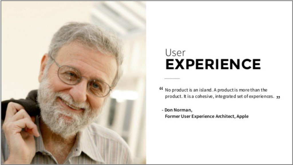
#1: 1993,
User Experience Architect, Donald Norman
Even
before the 1995 publication in HCI, meeting notes from a colleague of
Donald Norman’s at Apple surfaced from 1993, and stated that Norman changed his
job title from “User Interface Architect” to “User Experience Architect”.
Norman has discussed inventing the term
in interviews.
“I
invented the term because I thought Human Interface and usability were too
narrow: I wanted to cover all aspects of the person’s experience with a system,
including industrial design, graphics, the interface, the physical interaction,
and the manual.”
Mostly
the term UX was in use for the field of Human Computer Interaction, but this
term is now evolving. Norman also describes UX as “encompass[ing] all aspects
of the end-user’s interaction with the company, its services, and its
products”.
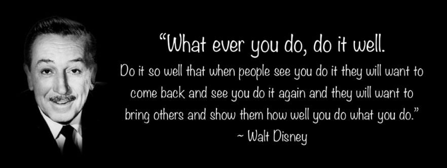
#2: 1966, Delighting Young Minds, Walt Disney
Walt Disney was an incredibly imaginative and dare I say — even magical person — with a childlike spirit and a perceptive mind for the future. He described the idea that would later become Disney World as, “always in the state of becoming, a place where the latest technology can be used to improve the lives of people.”
I also spoke with my grandfather about this as well — and he said they took my mom on opening day and couldn’t believe “we were made to feel cared for”, “the food was so good and cheap”, and “there were things there you’d never seen before”. I too remember Disney World, particularly Splash Mountain, Space Mountain, and then Tomorrow Land as my favorite parts — they had the concept of video phones (iPhones hadn’t been invented yet!), rocket ships to bring us to live on other planets, and monorails that would zip around at really high speeds (Elon Musk hadn’t been planning his Mars colony or the Hyperloop yet!) I’m sure everyone has their own special memories of Disney World, like the signatures from your favorite movie characters and being able to visit their colorful houses. Disney’s use of technology and delighting all of the senses with both nostalgia and futurism, creates happy memories that want to be repeated again and again, and is a huge inspiration for UX Designers today.
#3: 1955,
Designing for People, Henry Dreyfuss
Now
after speaking to my grandpa over the phone further, to find UX overlaps in the
good old days — he did mention a part of the company at IBM called “Human
Factors” and they were in charge of usability. Usability is only a portion, but
a very important portion of User Experience Design.
The lead person of this concept was Henry Dreyfuss, who was an American industrial designer who wrote the book called “Designing for People.” His concepts ensure not only designing for safety, but designing for a wide audience, so that people of different sizes and abilities, could access all parts of the product or service without trouble.
In his book, Dreyfuss writes: “When the point of contact between the product and the people becomes a point of friction, then the industrial designer has failed. On the other hand, if people are made safer, more comfortable, more eager to purchase, their product more efficient — or just plain happier — by using the product, then the designer has done his or her job successfully.”
Personally, I have a sectional couch that I moved into my smaller apartment. In order to fit, it must be split into 2 sections now, which makes it not as aesthetically pleasing, and my back arches in an unhealthy pose when working on it. And because of the couch-split, I have no room anymore to add an ergonomic desk chair! I may be using the couch now out of context, but it’s something worth considering for designers to imagine new ways of furniture that change as a person’s housing situation changes. Not all ideas succeed (at first) to work well with people and our fickle habits. This next history lesson about conveyor belts shows how very important prototyping and designing is for the end user.
#4: 1430 – 1930, Conveyor Belts of Da Vinci & Ford
Ali Rushdan Tariq describes that in circa 1430, Leonardo da Vinci designed conveyor belts to deliver food to kitchen preparers, and an early sprinkler system for safety measures. The prototype backfired when the conveyor belts operated too wildly and also the sprinkler system went off, ruining some food.
This was an early example of good-intented technology, but a bad UX! Ideas can be improved however.
Fast forward to the early 1900’s industrial revolution and we have these “conveyor belt” methods employed in factories and in the car building assembly line process first by Oldsmobile, then made famous by Ford in 1913. Toyota followed suit, but also focused on safety and input in the design process for people. Which led to inspire many UX designers!
#5: Circa 3000 BC, Feng Shui, an Ancient orm of UX?
Feng Shui is currently defined as “A Chinese philosophical system of harmonizing everyone with the surrounding environment.” It is classified as a physiognomy (observation of appearances through formulas and calculations), and it’s practice “discusses architecture in metaphoric terms of ‘invisible forces’ that bind the universe, earth, and humanity together, known as qi.”, and existed even well before the times of compasses.
The goal of Feng Shui is to situate the human-built environment on spots with good qi measured by location and purpose. It incorporates a lot of cleanliness and order, “white space” (in designer terms), balanced elements, some subjectivity, and design with functionality together. For example, if you leave your toilet seat open all the time, (not only is the smell and the look unappealing) but it’s said that you are “draining your money away”. This could surely be said for something like a bad smelling and looking restaurant as well — who would want to spend money there?
So
what does all that got to do with UX? Well, I know it’s silly, but that’s how I
got myself into UX, implementing Feng Shui into my design and development
process for the web” — Winston Huxley
It’s true that no one wants to see 10 pop-up ads in their apps, just like we don’t want to be interrupted tripping over socks in the hallway. This may be a trivial metaphor reiterating the point — but the koi fish has been highly admired in Chinese lore. The koi symbolizes powers of longevity, good fortune, success and courage, demonstrated by its ability to swim against currents and upstream. Placing a koi fish in one’s home (or in one’s game!) may bring those principles into one’s life! So long as your app is tidy.
I hope what you can take away from this article about the 5 Things You Didn’t Know about UX Design History — are lessons that you can incorporate in your product or service as a Whole in the world, as something to Delight, as a design that people can Use, and to expect some failures while improving Productivity, and to gain back some wins with the Balance of orderly qi. Good luck on your future UX endeavors, and let me know how they are going by leaving a comment.
UX Design Methodology is an approach or technique to analyze every aspect of a client’s specific business objectives. This methodology has become essential for creating successful websites. In basic terms, UX design is the process used to determine what a user’s experience will be like when interacting with a product. In this case, UX is applied to designing and building websites. A UX web designer carefully analyzes the client’s business objectives as well as the online business sector within which the client is competing.
Website design projects will differ dramatically from company to company, as will creative priorities. Using UX involves elements of research, testing, business analysis, project management and even psychology.
UX web designers are in increasing demand. Companies are just starting to realize the value the UX methodology brings to both the business and their newly designed website.
What does a UX designer actually do? There’s still a lot of confusion surrounding the field, which is why UX designers will often find their first task on a new project is to clearly explaining the value this process has on website design overall. The underlying sections will explain exactly what UX Designers bring to the table.
The Foundations of UX Design
Before we dive right into what UX designers actually do, let’s first take a look at how UX design came about.
UX is not new; in fact, the term has been around since the early nineties. The term has been credited to Donald Norman who joined Apple as a cognitive scientist. His desire was to explore all aspects of a user’s experience; including industrial design, graphics, the interface, and physical manual interaction.
The Initial Stages of UX Design
This is where the research (magic) happens. Let’s use the fictitious fast food chain Foodies as an example: Imagine Foodies approaches your company wanting a new app.
Firstly, it’ the UX designer’s role to combine desk-based and field research to get a full picture of who they are designing for. This might include reviewing what the current website has to offer, interviewing existing users to look for opportunities and pain points, and doing competitor research to see what else is out there.
Personas and Information Architecture
With the core features decided on, it is time to delve deeper into what tasks each persona wants to perform and why. Once this process has been completed for each persona, it is then possible to refine the content needed, working out the information architecture and site map and beginning paper prototypes. Paper prototypes are very rough sketches which can be shown to colleagues and quickly and easily improved.
Wireframes and User Testing
After paper prototypes are completed, UX designer prepares wireframes, initiates user testing, and iterates accordingly. Wireframes typically go through many stages, and there is no right or wrong way of doing them.
They often start as very basic black and white designs, moving on to interactive designs where users can navigate between the different pages like they will with the final product, to high-resolution designs which give the user a really clear idea of what the final product could look like. Each stage is punctuated with user testing and iterations.
Visual Design
Next comes the visual design where wireframes are converted into mock-ups. Mock-ups include the final imagery, color, and typography. The main focus is the look and feel; they should be pixel perfect and show exactly what the design will look like when brought to life so they can be used as a guide when development starts.
Some UX designers do the visual design themselves using programs such as Photoshop. However, visual design tends to fall under UI design, so this will normally be done by a UI designer.
Usability Testing and Beyond
With the visual design in place, there is a working prototype of the product which can be fully usability tested by participants who match the identified personas.
Several rounds of testing could take place before the design is completely right. Once it is, the new product is finally ready to go into development. UX designers also attend sprint meetings, overseeing product development to make sure there aren’t any feature creeps (which often happens in my experience!) and helping to make small refinements to the design as and when necessary.
One final point to make is that a UX designer’s work is rarely finished after the product launch. There will be refinements, small changes, new releases, feedback to gather and analytics to discuss with the team, just as Ryan describes in the video below. Technology is constantly evolving and it is essential to keep up-to-date with the latest developments or get left behind.


